Selecting and Creating the Right Visuals to Build Your Brand

Last Updated: February 24th, 2020
Topics:
Marketing
Guest Post by Angela Ash
When building a brand, choosing the right image to go with it is an absolute must. For an image to be powerful and memorable, it must showcase your business’s story and promise.
It is a well-known fact that visuals help people recognize and memorize things — that’s why they’re called visuals to begin with, right? And from our earliest days, we learn things by connecting them to appropriate visuals.
Because of this, marketing strategies have evolved to incorporate aggressive visual campaigns. When thinking about your business’s future prospects, it is therefore necessary to brainstorm your visuals.
What is a visual brand identity?
First of all, visuals don’t begin and end with a logo. To be sure, a memorable logo is tremendously important, but it is by no means the only piece of the larger picture you need to come up with to create your brand’s visual identity.
Proper visuals, as mentioned above, resonate with your brand’s identity and business culture and are, in that regard, way more than just nicely arranged shapes and colors.
It is crucial to connect the dots and design appropriate visuals that will be easily connected with your brand. Each visual is an element that tells the story of your brand and is easily associated with it.
The most common visuals contributing to a brand’s identity include the following:
- A logo
- Typography
- Image and composition styles
- Recognizable color patterns
Branding and visual recognition
As is the case with the success of so many factors when it comes to building a brand, visuals need to resonate with your audience. In order for them to do exactly that, you’ll need to define and get to know your audience well.
Your brand’s visuals should appear attractive to your audience. They also need to be unique, memorable, and consistent.
Only with the combination of these three factors can a visual be considered successful. Consistency, especially, is a crucial factor, as changing a brand’s style will only serve to confuse the audience, even if the design is more appealing.
Examples of memorable visual brand identities
Although it holds true that large businesses can allocate more substantial funds to brainstorm their visual identity, smaller businesses do not necessarily have to lag behind. Ultimately, all a brand needs in order to create memorable visuals is imagination.
A simple freelance platform research will get you enough professional designers working for affordable prices to last you a lifetime.
That being said, the saying “the sky's the limit” is only too accurate.
Let's see some successful examples from companies both large and small:

Oreo has chosen a bluish design consistent with their message. Can you imagine family-friendly cookies in black and fluorescent green? The collage appeared on Facebook and is consistent with the brand’s visual strategy.
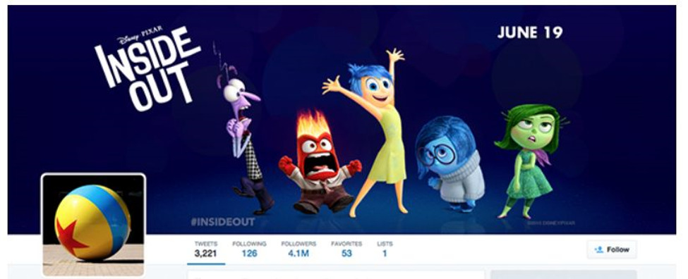
Next , Pixar is a great example of how banners can tell a story. This particular screenshot is from the brand’s Twitter page. As you can see, it tells a story at a glance by highlighting the studio’s latest release. Naturally, a new banner will pop up every time there is a new release.

Finally, the visuals king: Coca-Cola! The brand has built its whole success strategy on visual marketing. Their posts are widely recognizable and always feature a detail in red — just like the namesake drink.
Coca-Cola’s logo is the world’s most recognizable logo, closely followed by Apple. The distinction is, however, clear. The first brand has been around for a couple of decades longer than the latter, so it's had more time to establish its visual identity.

As far as logos go, there is some wisdom to be learned from the leaders in the field. For example, a bright red color is known to trigger impulse purchases, according to a study undertaken by Strategic Factory.
A color palette is sometimes more important than the logo itself. A great example of this is Marvel, which, let’s face it, doesn’t really top the list of most eye-catching logos out there.

Another successful brand that goes for simplicity coupled with a red color scheme is Pinterest. Need we go on?
Memorable shapes and colors
Merely a glance will tell you how all these brands have become easily recognizable by relying on a consistent color strategy and typography. Going deeper than that, you will notice that they are also consistent in the tone and message they present.
The combination of all these factors does wonders for a brand’s success, so take your time defining your visual strategy.
First, you’ll need a memorable logo. Logos are omnipresent: they’ll appear on your homepage and social media profiles, in all emails you send and on all your products. Because of that, they are worth the pain of coming up with the ideal one (settle for nothing less!).
Next, you will need a consistent color palette. Of course, colors may change during specific campaigns, notably those strongly related to certain color schemes (such as is, e.g., Halloween or Valentine’s Day). Remember that the color palette of your choice should reflect your brand’s message.
Again, you may use the examples from above to make some general deductions. Oreo sells food, and not just any food — cookies!
Taco Bell, by contrast, goes for a completely different set of colors (see below). The choice may appear a bit more aggressive, but the message is just as clear. After all, they sell Mexican food. What is the first association with Mexican food? Spicy, we’d say.

Choosing typography
Finally, there’s the proper font to consider. Not only does it have to be consistent with the message and imagery you wish to get across, but it also needs to remain consistent over time.
Let’s consider Coca-Cola again. The company's logo has changed time and time again and has yet remained as recognizable as it was in the brand’s beginnings.
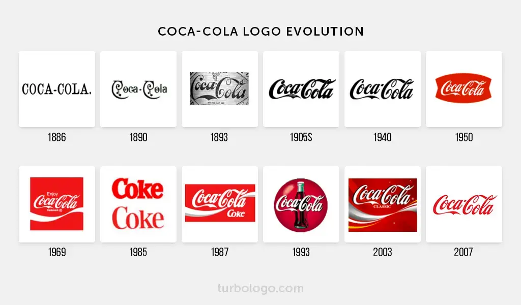
Source: Turbologo.com
Why?
The single most important thing about typography is that it needs to match both your brand personality and the audience’s perception of your brand.
Only by combining all these elements will you be able to come up with the best visual strategy for your brand.
As you can see, visuals are so much more than just a temporary way to attract the attention of your audience. They speak a success story and reflect on your business promise. Because of that, take your time to ask yourself what kind of message you really want to send and what kind of imagery will best illustrate it.
Once you know the answer to that question, your visuals are certain to become memorable, easily recognizable, and loved by your audience.
Angela Ash is a professional content writer and editor, with a myriad of experience in all forms of content management, SEO, proofreading, outreach, and social media. She currently works with Flow SEO, a boutique agency founded by Viola Eva, which offers in-depth SEO analysis, custom SEO strategies, and implementation.
Disclaimer: This article is not an indication that Best Company is affiliated with any of the companies whose logos are displayed.
The Top Business Loans Companies


The Top Business Loans Companies
Related Articles
Business Loans
How to Develop a Memorable Brand Identity
By Guest
July 22nd, 2022
Business Loans
How to Use Animated Logos for Your Business [with Examp...
Business Loans
Pandemic Workforce Impact: Keeping Employees Involved W...
By Guest
July 22nd, 2022
Get Our Newsletter - Be in the Know
Sign up below to receive a monthly newsletter containing relevant news, resources and expert tips on Business Loans and other products and services.
We promise not to spam you. Unsubscribe at any time. Privacy Policy